Weddings/Acrylics
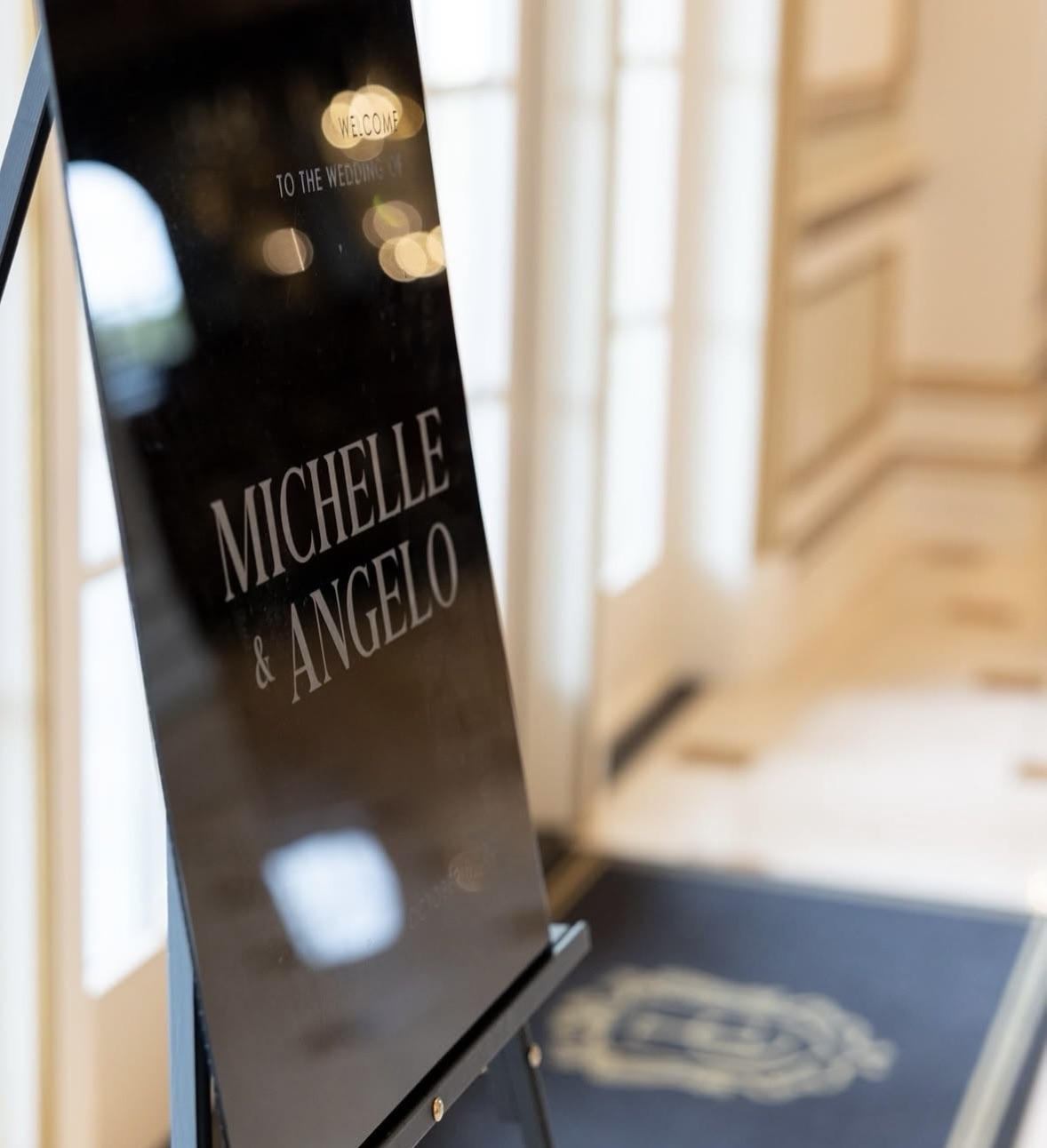
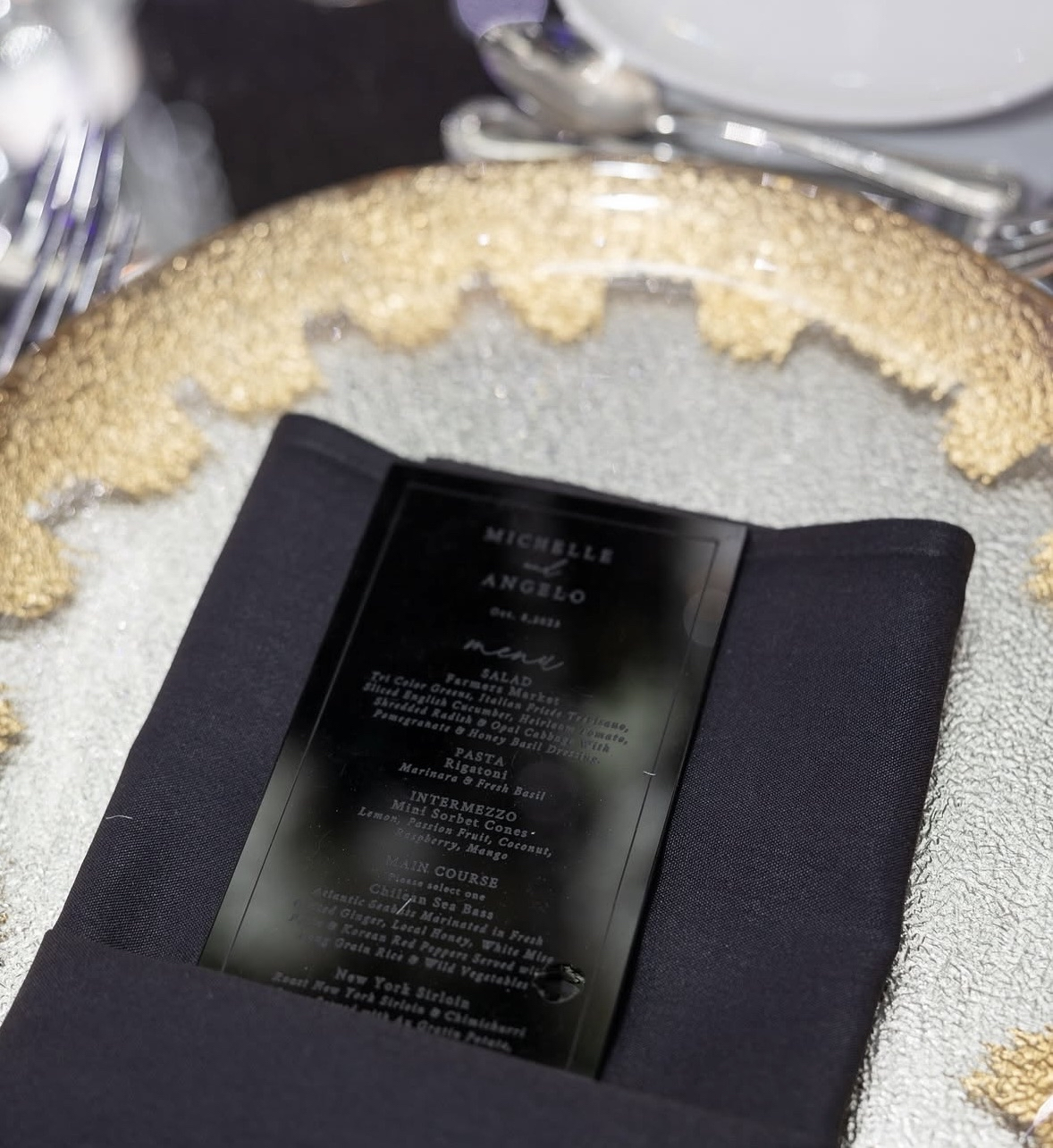
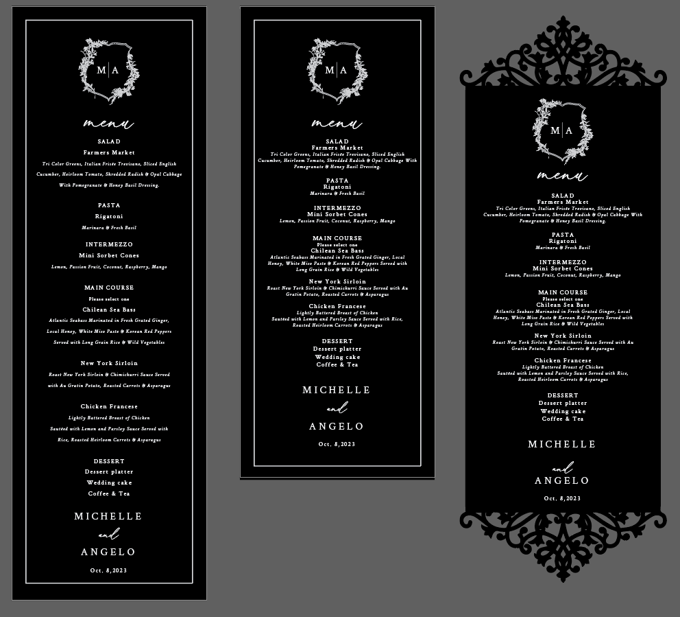
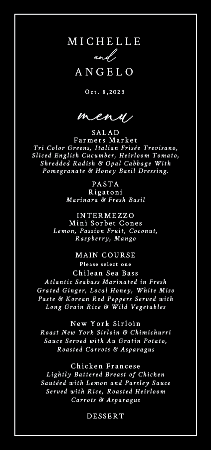
MICHELLE & ANGELO
Michelle and Angelo host a beautiful wedding at Legacy Castle in New Jersey.

To fit the theme of the venue, we were tasked to design and produce various wedding assets that showed a level of sophistication and luxury.
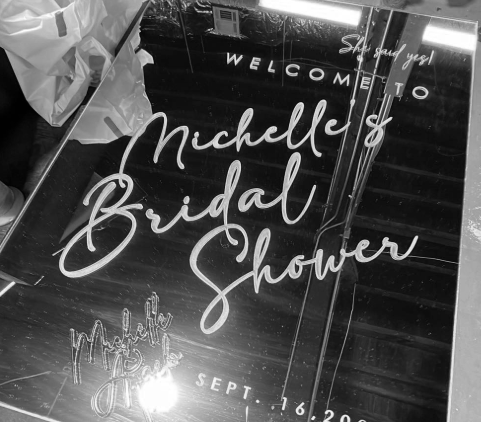
We ultimately decided on golden mirror acrylic for the cake topper, bridal shower sign, and the card/gift box. The smaller signage were done in clear acrylic. Last but not least, the remaining signage and menus will be done in black acrylic for better visibility.


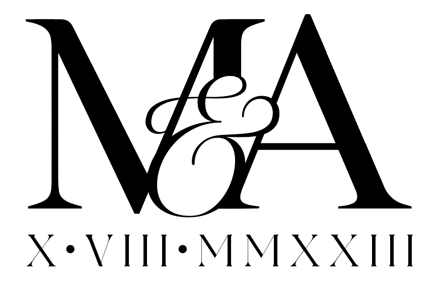
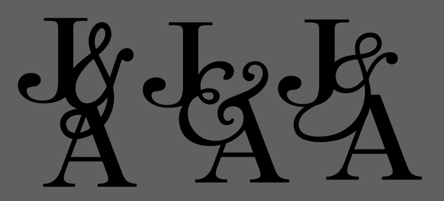
We experimented with several fonts and ended up mixing script with a serif typeface to give it a more extravagant outlook. We tried adding a crown-like design towards the top, but it ended up tacky, so we circled back. That was when we realized... less is more.
The little floral logo with the M|A also felt too over-the-top. That logo was not necessary at all; just the bride and groom’s name spelled out and their special day written underneath was perfect!
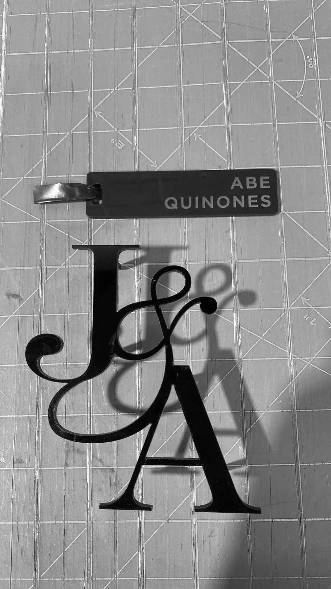
JENN & ACE
Jenn and Ace’s stunning destination wedding in many people’s dream vacation spot: Hawaii.
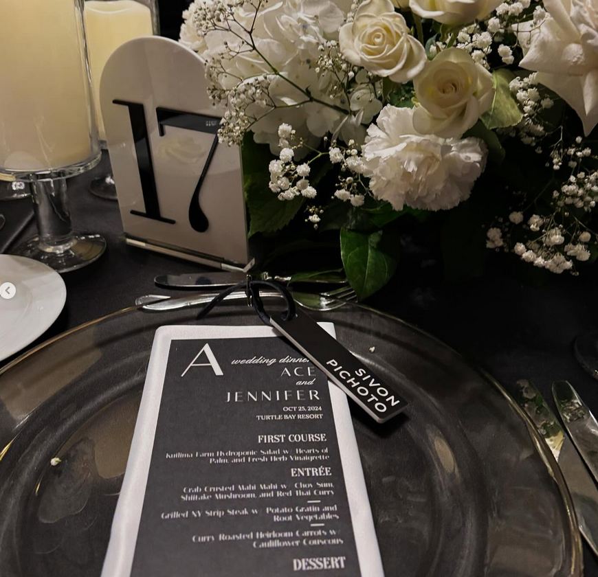
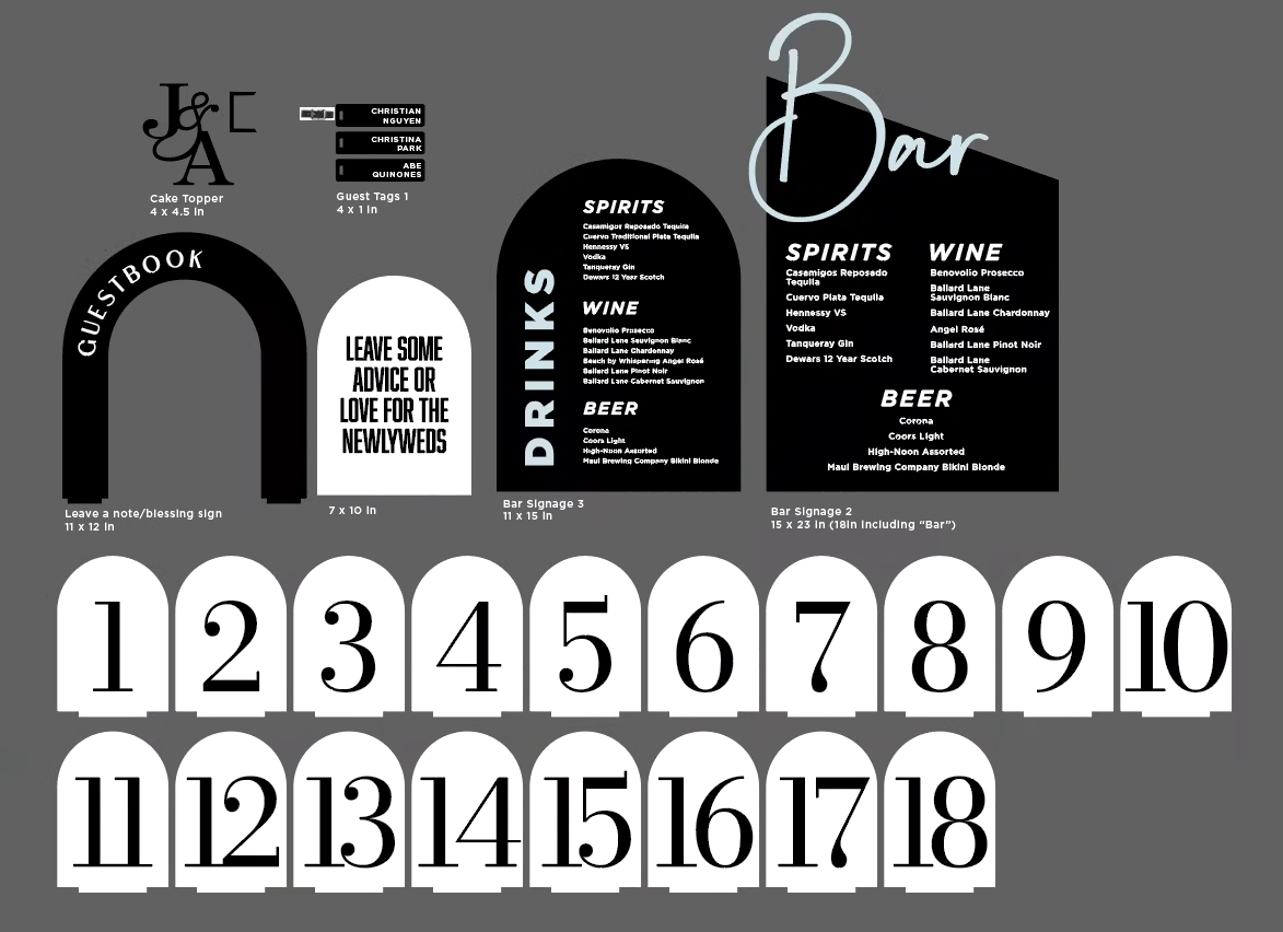
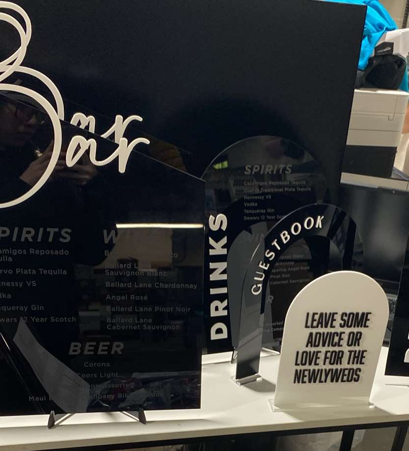
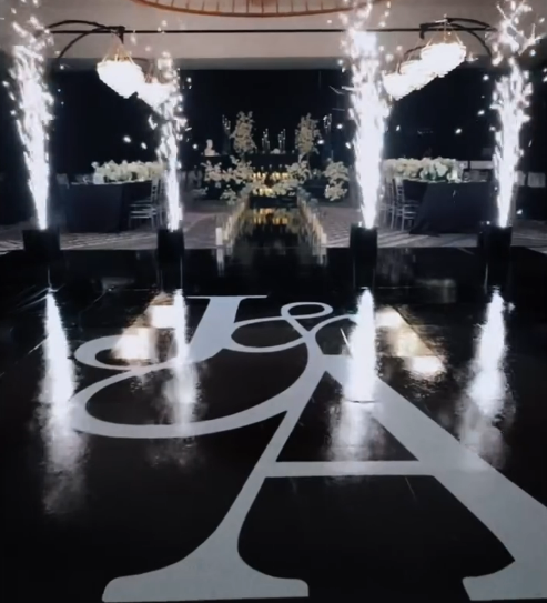
Your usual wedding signage and cake toppers.. but since it’s a destination wedding, it needs to stand out. There is a good chance most of the wedding guests were not from Hawaii. What is something that would make this wedding special?
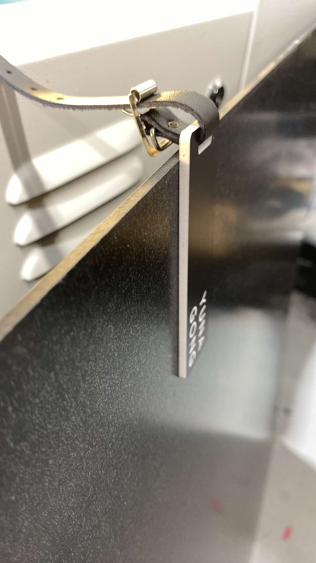
What about luggage tags for the guests?! This will be how they will be assigned seat!
We tested out 2 different acrylic types and we decided on a two-tone black-to-white to help make the names really pop.
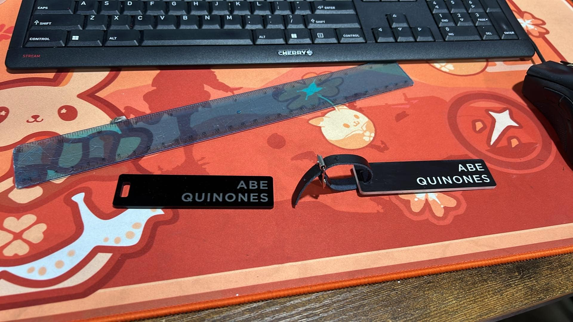
Unfortunately... they were a pain to clean. The way this material works is that the laser cutter will burn away the black layer on top, revealing the white layer that will form the design (in this case, the name). We had to scrub away any stubborn black pigment. They did not want to come off easily. My team and I scrubbed until we all had toned biceps and triceps on one arm.
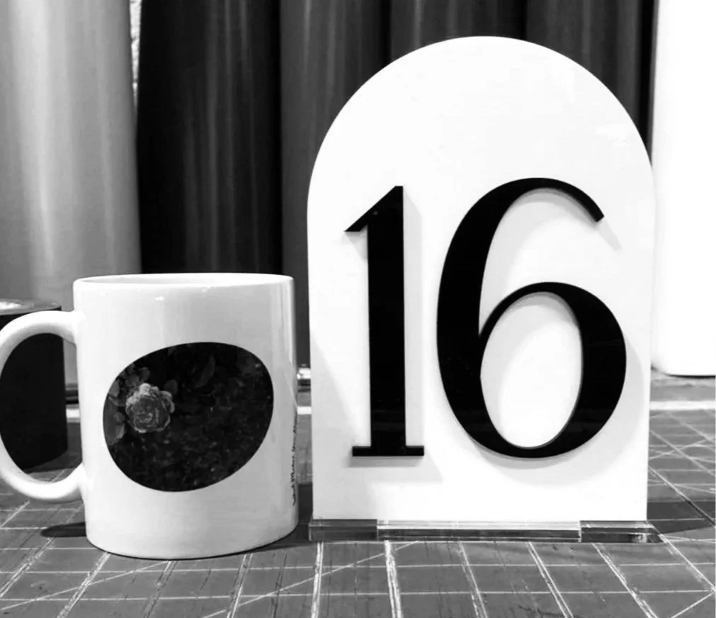
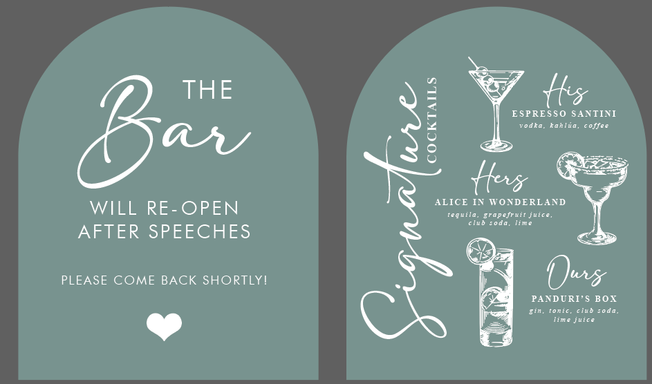
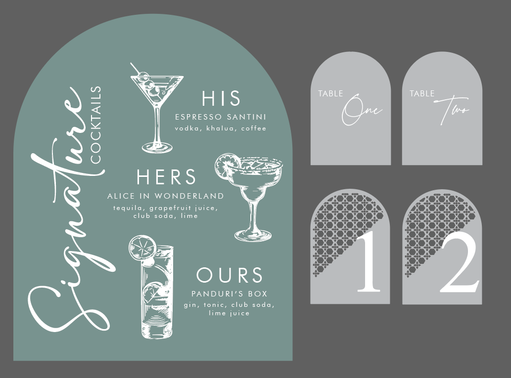
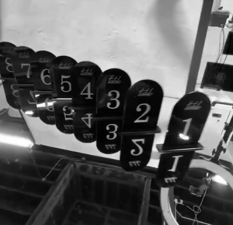
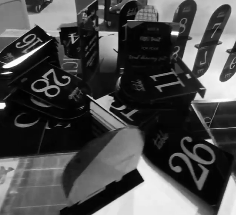
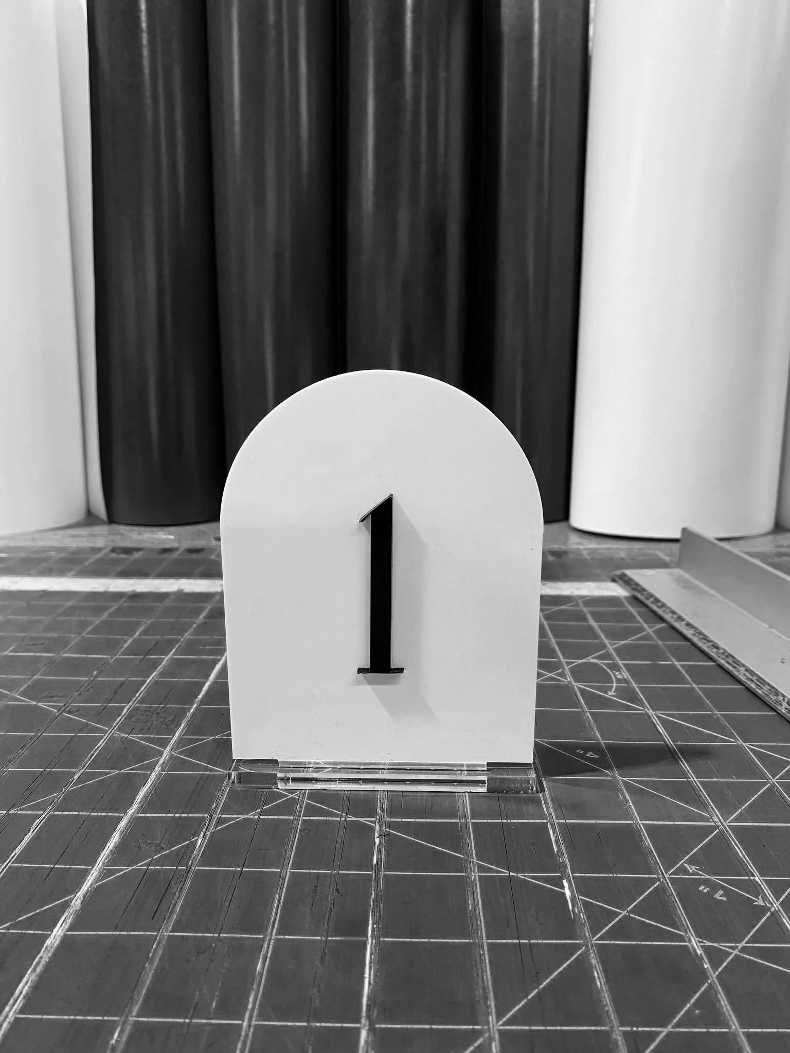
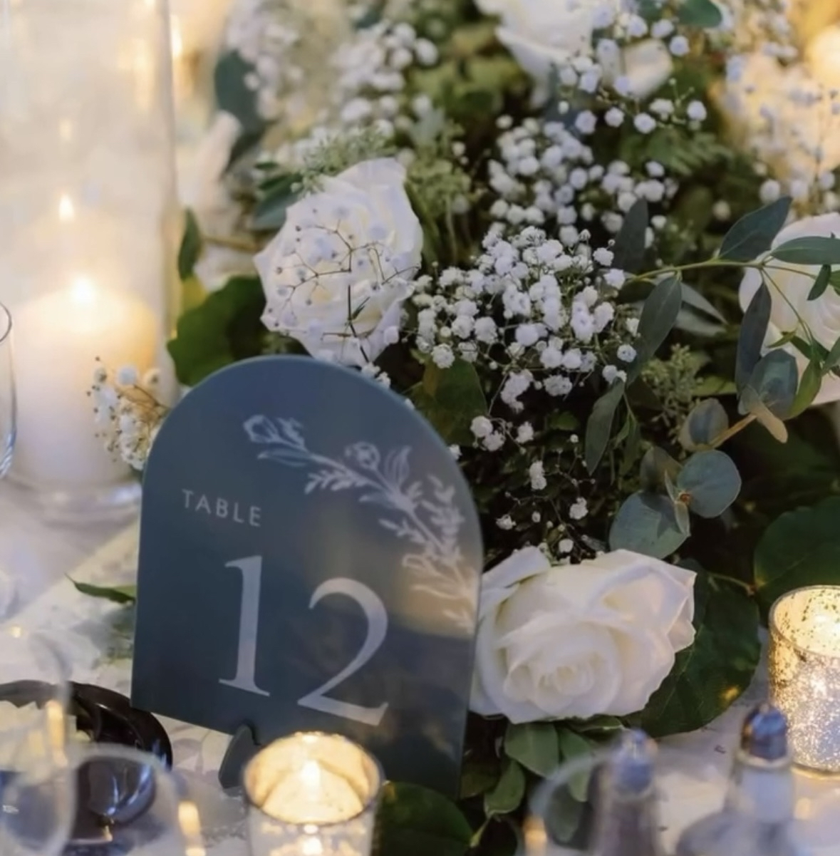
ALICE
Alice had a vision and was only missing the teal signage. Etsy did not have it; nobody had it; she couldn’t figure out where to get this specific color. We got her back. I dug through 4 pages on Google to find the perfect shade with the matte finish she requested.


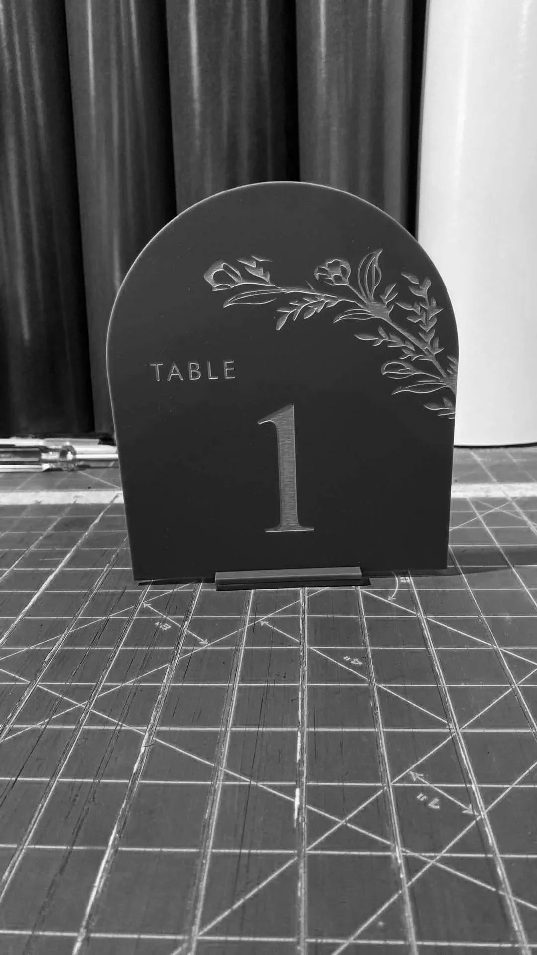
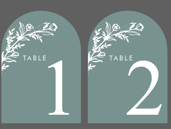
I honestly really liked the design with the cut-out patterns when I was setting up the file, but we agreed it was too much. It was fun making it, though! The script also wasn’t legible, so the safer bet was to go with large numbers so the guests could see the tables clearly.
In the end, we went with a floral design to match the flowers she already purchased for the centerpiece!

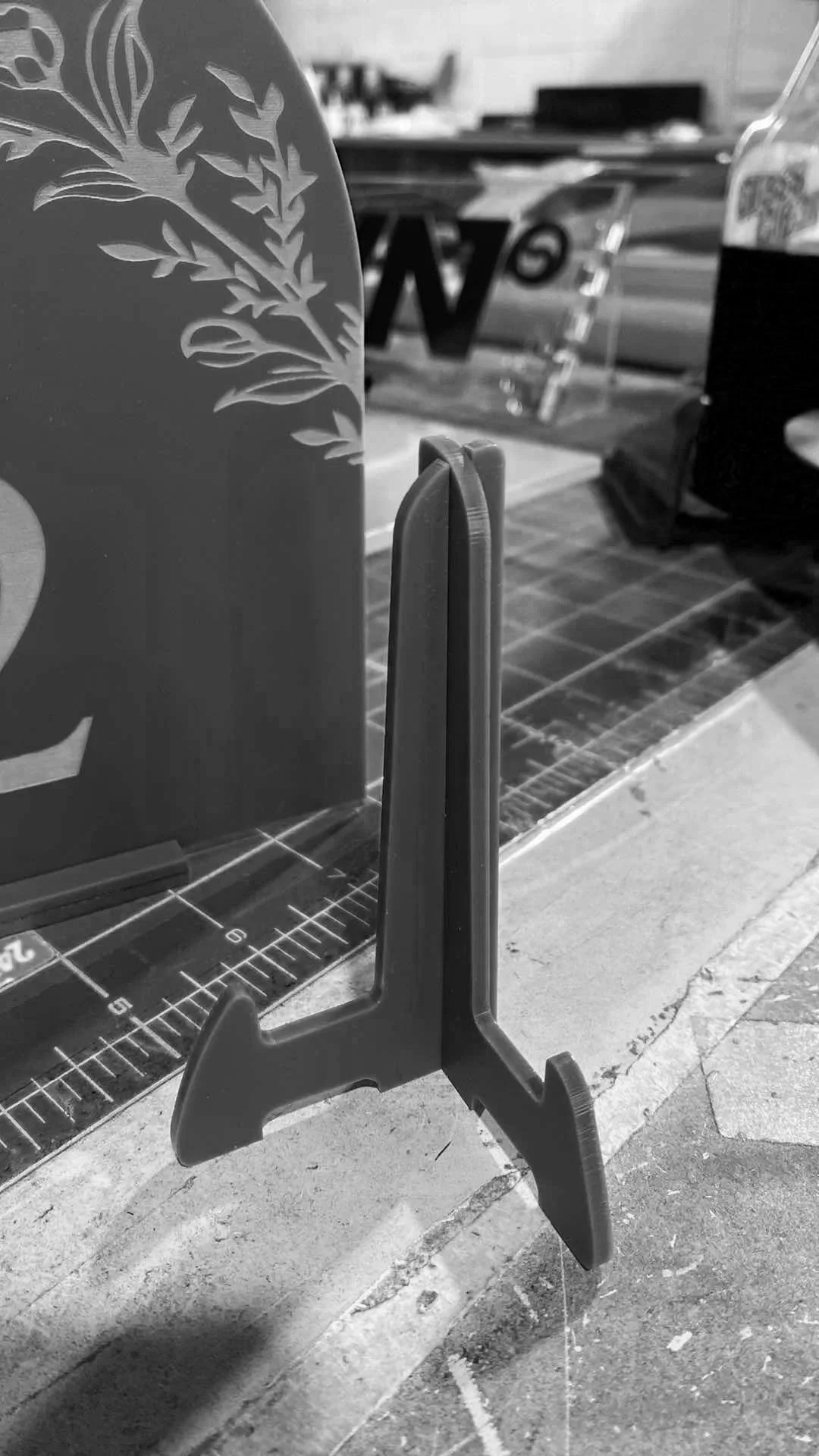
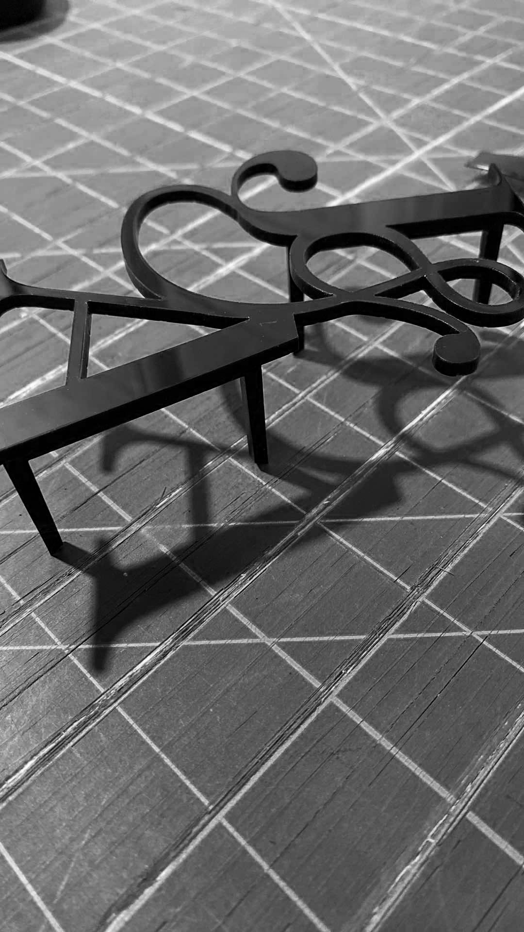
We tell our clients that these do not come with stands. We usually have them pick one they like off Amazon since they are sold there. However, we have leftover acrylic and we decided that we could just make one for her (and it was also requested.. couldn’t say no since her wedding was soon and we didn’t want her to stress.) Alice really liked the small slab for a more subtle look, but when the slab is that thin and tiny, it really doesn’t hold well.
We were able to make her what I like to call "the rocket ship”. It took me a few tries to get the proper measurements so that the two pieces could slide into one another to form a stand. I kept messing up because this was the first time making a stand, but thankfully, we had plenty of leftovers for me to do some testing!